<aside>
🔗 Medium Link: https://chinguyenthuy.medium.com/sketch-how-to-make-scalable-symbol-2-badge-tags-52249f1057b9
</aside>
Are you having this problem when you’re working with your badge symbol?
- The container does not scale to the size of the content. Or when you try to resize, the symbol is broken. Then you end up detaching it from the symbol🤦♀️
- Or it could be better like this. The elements inside are fixed in position, so no problem when resizing the symbol. But you also need to adjust the padding manually.
If you’re having this problem, you are in the right place! This article may help you.
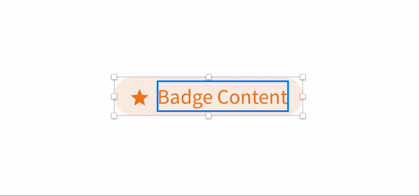
- Do you want your symbol will work like this?
- The badge container will grow as the size of the text
1. Create Text Style and Layer Style for the component
I bet you already did that for your product’s colour palette in the Sketch library.
However, to make the components more organized and easy to use by other designers, I strongly recommend that the text style and colour style applied to a specific component should be added in a separate folder.
Here are the reasons:
- The colour pallets include many colours and typography too. However, only certain rules and style on the colour and text is applied to specific components.
- It helps reduce the cognitive load about rules of colour or text.
- It's easier to manage and change the colour within a component.
✅ Tips for organizing:

-
You can number the components. The sketch will display alphabetically, so numbering can help you to arrange the order you want.
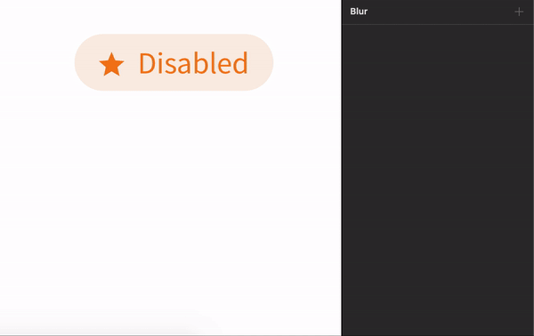
When you already set the Text style and Layer style for the Badge, remember to apply them to the symbol you create. 😉
-
Name the elements properly, then you can see what you can benefit from that while you are using it later.